Mar 31, 2010
reliance
so it's come to the time where you have to make a lot of decisions regarding your own life. How are you going to handle failure? How are you going to handle the uncertain? Are you going to develop your own way, or follow someone elses'? ... yeah. I'm there.

Mar 11, 2010
Typographically Brody
Well, Project II in Typography was to develop a typeface that mirrored the style of a designer of our choice. I chose Neville Brody. After developing your letter forms, we had to create a poster advertising said designer.
I knew from the start that I wanted to make really thick, minimalistic letters that showed off the recognizable style of Brody.

I chose the colors I did beacuse Brody liked bold colors and I felt like it really stood out. My overall idea for the poster is that Brody did things differently and he did them in a way that you could not ignore. So, why Brody? ... because he's Brody. That's why.
After critique, however, I came away quite defeated. My grid is apparently weak, and I have "dead ends" in my composition. My colors don't work and the only good thing about it is my letter forms. I was really proud of the work I did and excited about the conscious choices that I made. But after hearing the criticism, which was not entirely off-base (so don't think I'm saying they were wrong), I began to see the flaws... I recognize the fact that my piece was not flawless, or even close to being awesome, but I felt as though I accomplished nothing.
Here it is: (just ignore the crop marks on the side... I had to take a screen shot on my PC because I didn't save this as a JPG...ha)
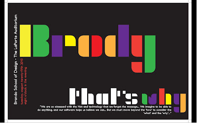
I knew from the start that I wanted to make really thick, minimalistic letters that showed off the recognizable style of Brody.
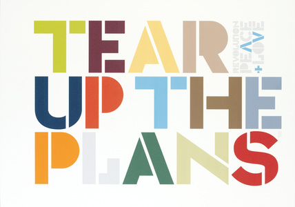
Most of my inspiration came from the image to your right. Despite the fact that Brody often involved complex backrground to stand in contrast with his simple letters, I was drawn to this simple design as well.
- Initially, the stacked style of the Freedom poster was what I was going for, but with my letterforms, "Neville" would become "New lle" or "Nev hle" It just didn't look right. It was a rough issue with my letters that had no solution.
- Also take note that BOTH posters involved vertical type which I brought into my poster design as well.
- Lastly, I want to add that my secondary typeface was Petita Bold - happily suggested by my Prof. It works well to mirror the distinct forms of my characters and the x-height ratio and what not.

I chose the colors I did beacuse Brody liked bold colors and I felt like it really stood out. My overall idea for the poster is that Brody did things differently and he did them in a way that you could not ignore. So, why Brody? ... because he's Brody. That's why.
After critique, however, I came away quite defeated. My grid is apparently weak, and I have "dead ends" in my composition. My colors don't work and the only good thing about it is my letter forms. I was really proud of the work I did and excited about the conscious choices that I made. But after hearing the criticism, which was not entirely off-base (so don't think I'm saying they were wrong), I began to see the flaws... I recognize the fact that my piece was not flawless, or even close to being awesome, but I felt as though I accomplished nothing.
Here it is: (just ignore the crop marks on the side... I had to take a screen shot on my PC because I didn't save this as a JPG...ha)

One Love.
Ya know, I believe that a lot of things in this world are wrong. I believe pressing your opinions onto others is wrong. I believe that there is truth, and if people choose to look away, it is our job to show them the truth and not to condemn them for their choice. I believe that treating someone unfairly regardless of the reason is wrong - race, belief, orientation, idc.
With that in mind, get over yourself.
I read about a high school senior today named Constance McMillen today... she's a lesbian in Mississippi, and her Prom was completely canceled because she asked if she could escort her girlfriend. I mean, I'm not entirely for Gay Rights, but I am in no way against the fair treatment of human beings... It just upsets me. In one article she is quoted to have said "well, we do live in the Bible-belt..." Now, tell me... is that sending her a positive image of the Truth that we should show her? No.
I'm not getting on a podium here, but today I really saw some inequality... in how people speak, in what they say, and in how they act. It's ridiculous.
K. I'm done
With that in mind, get over yourself.
I read about a high school senior today named Constance McMillen today... she's a lesbian in Mississippi, and her Prom was completely canceled because she asked if she could escort her girlfriend. I mean, I'm not entirely for Gay Rights, but I am in no way against the fair treatment of human beings... It just upsets me. In one article she is quoted to have said "well, we do live in the Bible-belt..." Now, tell me... is that sending her a positive image of the Truth that we should show her? No.
I'm not getting on a podium here, but today I really saw some inequality... in how people speak, in what they say, and in how they act. It's ridiculous.
K. I'm done
Mar 5, 2010
funny the way it is
- words of Dave Matthews.
Ya know, in my last post I mentioned how I'm working to grow beyond my sudden struggles with bitterness and it's funny how God presents you moments when you really have to decide whether you're going to be bitter or whether you're going to let it go. I just, wow. unexpected, unthinkable, illogical moments that seem so insignificant, but after the initial shock you stop and think of all the terrible things that you associate with that person or place, and it hits you. "Here is my moment to really move on"... All the complaints and the hurt and the grudges just fade as you open yourself back up despite the fear nipping at your insides.
Maybe for some of you it's a family member that completely mistreated you as a kid, or an ex-boyfriend, or a rival in the workplace... who knows. But I know what gets me, and I know what I need to learn to let go of, and God is clearly working on it for me, so with His help I'm sure to overcome this.
Maybe for some of you it's a family member that completely mistreated you as a kid, or an ex-boyfriend, or a rival in the workplace... who knows. But I know what gets me, and I know what I need to learn to let go of, and God is clearly working on it for me, so with His help I'm sure to overcome this.
Feb 22, 2010
bleghhck.
frankly, I'm tired.
I'm ready for summer vacation.
I just want to sit in my hammock and read my book until Friday - no class.
That would be the life, eh? breeze coming through the open window, no worries... just the text passing before your eyes, leaving you hanging onto every word awaiting the next... Maybe eating a bon bon or two, oh wait... that's where it gets to be too much. But realistically I need to get off of my bed, get dressed, go run errands and make it to the painting lab before lunch, eat, go BACK to painting, go to my next class, leave there, find time to meet with people for my hall event, have a staff meeting, finish my #%(& drawing and typography homework and then MAYBE consider going to sleep... yeah. tired.
Now that I've complained and probably made you never want to read my blog again ("oh my god, she's so whiney"), let me clarify:
I am merely stressed, and working to overcome my bitterness, so please excuse my current foul mood.
Positivity is something I have always been great at without much effort, and I'm slowly losing sight of that, so I'm diligently working to shake whatever funk I've fallen into that has since sucked it out of me. SO, basically this post has no real meaning... just a rant and confession. thanks.
Caryn
I'm ready for summer vacation.
I just want to sit in my hammock and read my book until Friday - no class.
That would be the life, eh? breeze coming through the open window, no worries... just the text passing before your eyes, leaving you hanging onto every word awaiting the next... Maybe eating a bon bon or two, oh wait... that's where it gets to be too much. But realistically I need to get off of my bed, get dressed, go run errands and make it to the painting lab before lunch, eat, go BACK to painting, go to my next class, leave there, find time to meet with people for my hall event, have a staff meeting, finish my #%(& drawing and typography homework and then MAYBE consider going to sleep... yeah. tired.
Now that I've complained and probably made you never want to read my blog again ("oh my god, she's so whiney"), let me clarify:
I am merely stressed, and working to overcome my bitterness, so please excuse my current foul mood.
Positivity is something I have always been great at without much effort, and I'm slowly losing sight of that, so I'm diligently working to shake whatever funk I've fallen into that has since sucked it out of me. SO, basically this post has no real meaning... just a rant and confession. thanks.
Caryn
Feb 18, 2010
The Best of Two Years Past...
As I gather up my strongest pieces from my last two years of art classes here at AU for my sophomore portfolio, I thought it would be really special to post those for you, my very valuable reader, to see. So, here is what I've been doing for the past two years in my art world:
Art 105 (Foundations) - Fall '08

Contour Project: assigned a still life to draw using contours (no shading!)


The Abstract Sculpture: This project required us to develop a sculpture from mostly foam board that would convey a social issue or issue that is relevant to many people. I chose to capture the continuing genocide in Africa due to the AIDS epidemic.
Art 106 (Foundations 2) - Spring '09

Pointillism Project: We were to create an conceptual composition using several images and render them using only dots of cyan, magenta, yellow and black. This is called "Meaning the Escape"

The Non-objective Project: For this project I chose one non-objective painting and had to interpret it and create a three dimensional sculpture to represent it. It was quite fun to do - note that this sculpture is completely free standing.
Painting I - Fall '09


Well, that's not the entire portfolio, but it's the best of it and the pieces I'm most proud of. Hope you enjoy
Caryn
Art 105 (Foundations) - Fall '08

Contour Project: assigned a still life to draw using contours (no shading!)


The Abstract Sculpture: This project required us to develop a sculpture from mostly foam board that would convey a social issue or issue that is relevant to many people. I chose to capture the continuing genocide in Africa due to the AIDS epidemic.

Pointillism Project: We were to create an conceptual composition using several images and render them using only dots of cyan, magenta, yellow and black. This is called "Meaning the Escape"

The Non-objective Project: For this project I chose one non-objective painting and had to interpret it and create a three dimensional sculpture to represent it. It was quite fun to do - note that this sculpture is completely free standing.

Photorealism Project: For this project we were to make our painting as closely identical to our chosen image as possible. I did a posterized self-portrait with a palette knife and was quite surprised how well it turned out. This is 30x36"
Graphic Design I - Fall '09
A type self portrait. This is made completely of song lyrics and is sized at about 11x17".
Well, that's not the entire portfolio, but it's the best of it and the pieces I'm most proud of. Hope you enjoy
Caryn
Feb 17, 2010
Untainted.
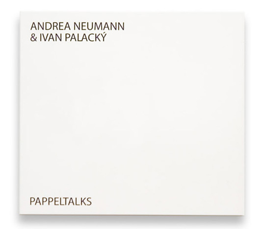
This would be the new CD you just purchased. It's a new album by Uceroz (a new music brand by Ivan Palacký), it's a musician playing an amplified knitting machine called Dopleta 160 (180). "The title “Uceroz” is an abbreviation created from two Czech words : „učesán a rozcuchán“. It consists of two editions, where „učesán“ represents a smoother kind of musical expressiveness however „rozcuchán“ tends to be more experimental."
Basically what you have here is a very new and unheard of sample of music... You reach to open the pure white package, and this is what occurs.
Now, not only is the cover "tainted" by this ink forever, but that music can never again be unheard by your ears. These designers are SO brilliant, and this is such an amazing approach to not only music, but to art and design as well. bravo.
To read more, check out: http://lovelypackage.com/pappeltalks/#more-10820
thanks.
Basically what you have here is a very new and unheard of sample of music... You reach to open the pure white package, and this is what occurs.
PAPPELTALKS from vizage on Vimeo.
Now, not only is the cover "tainted" by this ink forever, but that music can never again be unheard by your ears. These designers are SO brilliant, and this is such an amazing approach to not only music, but to art and design as well. bravo.
To read more, check out: http://lovelypackage.com/pappeltalks/#more-10820
thanks.
Subscribe to:
Posts (Atom)