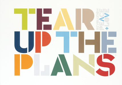
I knew from the start that I wanted to make really thick, minimalistic letters that showed off the recognizable style of Brody.
Most of my inspiration came from the image to your right. Despite the fact that Brody often involved complex backrground to stand in contrast with his simple letters, I was drawn to this simple design as well.
- Initially, the stacked style of the Freedom poster was what I was going for, but with my letterforms, "Neville" would become "New lle" or "Nev hle" It just didn't look right. It was a rough issue with my letters that had no solution.
- Also take note that BOTH posters involved vertical type which I brought into my poster design as well.
- Lastly, I want to add that my secondary typeface was Petita Bold - happily suggested by my Prof. It works well to mirror the distinct forms of my characters and the x-height ratio and what not.

I chose the colors I did beacuse Brody liked bold colors and I felt like it really stood out. My overall idea for the poster is that Brody did things differently and he did them in a way that you could not ignore. So, why Brody? ... because he's Brody. That's why.
After critique, however, I came away quite defeated. My grid is apparently weak, and I have "dead ends" in my composition. My colors don't work and the only good thing about it is my letter forms. I was really proud of the work I did and excited about the conscious choices that I made. But after hearing the criticism, which was not entirely off-base (so don't think I'm saying they were wrong), I began to see the flaws... I recognize the fact that my piece was not flawless, or even close to being awesome, but I felt as though I accomplished nothing.
Here it is: (just ignore the crop marks on the side... I had to take a screen shot on my PC because I didn't save this as a JPG...ha)


No comments:
Post a Comment