Jun 10, 2010

May 30, 2010
Summer Project
so, in light of some things that have happened, I accidentally started a painting... when I was in a need to do some therapeutic activities... sooo it turned into something pretty cool (still a work in progress), and I decided to make a series out of it, maybe. Ya know, the process and changes in emotion as time goes on... So, my oh so large audience, keep a look out for upcoming photos and details about my summer project.
May 29, 2010
finally my final painting
Well, back in April I explained that I was working on an homage to the infamous Pablo Picasso for my final project in painting... so I finally got around to taking a picture of it for you, my viewers (whom I can probably count on one hand... but no matter!)
Unfortunately the picture really distorted the color despite my efforts to correct it... although there are a lot of cooler hues involved, the over all color of the piece is a very red-violet and a lot of oranges.
Basically this piece only have two elements to it: color and texture.
The colors I used were all very bold, oranges, violets, reds, and blues... but all the colors were acrylic washes - applied through various stages of the process (some wet-on-wet, other wet-on-dry). The gesso itself actually has sand rubbed into it to add to the over all texture of the piece. The words and figure were drawn on using acrylic paint put into a ziploc bag almost like a cake-decorating bag. It was rather fun to use an unexpected technique and my professor thought it quite clever. After the words and figure dried I did countless washes over them, creating this really interesting effect that left parts of the piece untouched - which I really really liked.
The figure is actually a blind contour, something I thought would mirror, but not replicate, the drawing style of Picasso. The quote says 'I am always doing that which I can not do in order that I may learn to do it'... this is something that I struggled with personally in the past (giving up on a new technique or lesson if it didn't immediately prove fruitful), and I felt like Picasso easily embodied a lot of the qualities that I lack, so it felt appropriate to use this quote for my piece. Furthermore, I copied the quote twice because it almost felt like a mantra, something that bears to be repeated to yourself as you try to learn its meaning...

Overall, I wanted this piece to be something that was difficult for me - and let me tell you it was. Its lack of content was what bothered me the most, and the fact that it only took me about 3 of the 5 weeks we had to work on it was the WORST part because I continually wanted to add to it - which is another weakness of mine. Picasso never worried about what others would think of his work, he would have an idea and the go for it, something that managed to occur with this painting. I tried not to over-do it, or try to hard, and I actually really liked the way it came out. I'm proud of it, to say the least, but I realize it's not a masterpiece.

Unfortunately the picture really distorted the color despite my efforts to correct it... although there are a lot of cooler hues involved, the over all color of the piece is a very red-violet and a lot of oranges.
Basically this piece only have two elements to it: color and texture.
The colors I used were all very bold, oranges, violets, reds, and blues... but all the colors were acrylic washes - applied through various stages of the process (some wet-on-wet, other wet-on-dry). The gesso itself actually has sand rubbed into it to add to the over all texture of the piece. The words and figure were drawn on using acrylic paint put into a ziploc bag almost like a cake-decorating bag. It was rather fun to use an unexpected technique and my professor thought it quite clever. After the words and figure dried I did countless washes over them, creating this really interesting effect that left parts of the piece untouched - which I really really liked.
The figure is actually a blind contour, something I thought would mirror, but not replicate, the drawing style of Picasso. The quote says 'I am always doing that which I can not do in order that I may learn to do it'... this is something that I struggled with personally in the past (giving up on a new technique or lesson if it didn't immediately prove fruitful), and I felt like Picasso easily embodied a lot of the qualities that I lack, so it felt appropriate to use this quote for my piece. Furthermore, I copied the quote twice because it almost felt like a mantra, something that bears to be repeated to yourself as you try to learn its meaning...

Overall, I wanted this piece to be something that was difficult for me - and let me tell you it was. Its lack of content was what bothered me the most, and the fact that it only took me about 3 of the 5 weeks we had to work on it was the WORST part because I continually wanted to add to it - which is another weakness of mine. Picasso never worried about what others would think of his work, he would have an idea and the go for it, something that managed to occur with this painting. I tried not to over-do it, or try to hard, and I actually really liked the way it came out. I'm proud of it, to say the least, but I realize it's not a masterpiece.
May 25, 2010
song of the day
I catalog these steps now
Decisive and intentioned
precise and patterned specifically to yours.
I'm talented at breathing
Especially exhaling
So that my chest will rise and fall with yours
I'm careful not to wake you
Fearing conversation
It's better just to hold you
And keep you pacified
I'm talented with reason
I cover all the angles
I can fail before I ever try
Try to understand there's an old mistake that fools will make
And I'm the king of them, pushing everything that's good away
Wont you hold me now (I will not bend I will not break)
Wont you hold me now (I will not bend I will not break)
I am fairly agile
I can bend and not break
Or I can break and take it with a smile
And I am so resilient
I recover quickly
I'll convince you soon that I am fine
Try to understand there's and old mistake that fools will make
And I'm the king of them, pushing everything that's good away
Wont you hold me now (I will not bend I will not break)
Wont you hold me now (For you I rise, for you I fall)
Just hold me close to you, just hold me close to you
Just hold me close to you, just hold me close to you, to you
And try to understand there's and old mistake that fools will make
And I'm the king of them, pushing everything that's good away
So wont you hold me now?
Wont you hold me now?
Now, now, now, now, now
Decisive and intentioned
precise and patterned specifically to yours.
I'm talented at breathing
Especially exhaling
So that my chest will rise and fall with yours
I'm careful not to wake you
Fearing conversation
It's better just to hold you
And keep you pacified
I'm talented with reason
I cover all the angles
I can fail before I ever try
Try to understand there's an old mistake that fools will make
And I'm the king of them, pushing everything that's good away
Wont you hold me now (I will not bend I will not break)
Wont you hold me now (I will not bend I will not break)
I am fairly agile
I can bend and not break
Or I can break and take it with a smile
And I am so resilient
I recover quickly
I'll convince you soon that I am fine
Try to understand there's and old mistake that fools will make
And I'm the king of them, pushing everything that's good away
Wont you hold me now (I will not bend I will not break)
Wont you hold me now (For you I rise, for you I fall)
Just hold me close to you, just hold me close to you
Just hold me close to you, just hold me close to you, to you
And try to understand there's and old mistake that fools will make
And I'm the king of them, pushing everything that's good away
So wont you hold me now?
Wont you hold me now?
Now, now, now, now, now
May 17, 2010

May 15, 2010
May 14, 2010
Laz Marquez?
Here is just something I stumbled upon... pretty snazzy bookcovers, or movie posters... idk. I can't read french.

for more, go to the original site: http://www.fubiz.net/2010/04/07/laz-marquez/
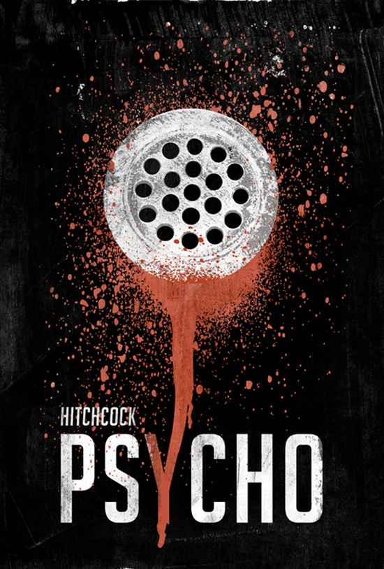
for more, go to the original site: http://www.fubiz.net/2010/04/07/laz-marquez/
May 11, 2010
summer begins
well... here I am trying to feel like i'm all grown up. Sitting in my new Stringer common room, I can't help but kinda wish I was home with my family running around or watching tv; instead i'm just sitting here basically alone. It's not a bad alone, I feel fine, but it's just different... this doesn't feel like a dorm because everyone is gone to work or at classes all day... so I mean, I guess this is real life.
If you don't already know, I made the difficult decision to stay in Anderson this summer as a summer RA for little to no pay. I haven't gotten another job yet, but I'm trusting that God will provide for me how He sees fit and that things will be fine so long as I pursue Him in my plans and trust Him... that's kinda hard to say.
next summer i'll be interning and working my butt off to make ends meet and pay rent in the crappy apartment I'll most likely get. so I see this summer as good practice I reckon, and quite frankly, it's going to be good overall to learn to take care of some responsibilities on my own. idk, it's a growing experience for sure - just rough right now. anyways, i'm excited about this for real, and I'm going to stop complaining now. :)
If you don't already know, I made the difficult decision to stay in Anderson this summer as a summer RA for little to no pay. I haven't gotten another job yet, but I'm trusting that God will provide for me how He sees fit and that things will be fine so long as I pursue Him in my plans and trust Him... that's kinda hard to say.
next summer i'll be interning and working my butt off to make ends meet and pay rent in the crappy apartment I'll most likely get. so I see this summer as good practice I reckon, and quite frankly, it's going to be good overall to learn to take care of some responsibilities on my own. idk, it's a growing experience for sure - just rough right now. anyways, i'm excited about this for real, and I'm going to stop complaining now. :)
May 5, 2010
May 4, 2010
Meet Chloe

This is the typeface I developed for my final. I wanted to achieve a certain level of youthfulness and class while still maintaining legibility. It became a lot easier to create cohesive character traits once I, in face, created a real character - which is the lovely lady you see above, Chloe. I dove into her character until I knew what kind of shoes she would wear... The dynamic stroke weights mirror her dynamic personality and the classic look this creates reflects her classy style and beautifully simplistic attitude.
I neglected to mention my color scheme during my presentation, but I used these colors because they are simple, feminine and calm. The colors are repeated throughout both the illustrations and the process book. The feminine touch was really a big bonus that I achieved with my serifs because I intended for Chloe to be used in print to replace the typical typefaces in magazines.
May 3, 2010
41 fun alphabets
Amazing. 41 crazy cool alphabets... what a great thing to find on the last day of typography
check it
check it
Apr 24, 2010


Apr 23, 2010
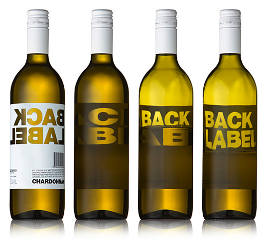
Modern Dog Poster Designs


..so I was browsing and I came across this design company that now possesses my heart (kiiiinda like the Death Cab song).
They have about a bagillion other posters if you want to check them out. I really love the hand-made feel that most of them have and how they typically use custom type, so I'm a fan, definitely.
They have about a bagillion other posters if you want to check them out. I really love the hand-made feel that most of them have and how they typically use custom type, so I'm a fan, definitely.
Apr 20, 2010

Apr 18, 2010
final painting
so for my final painting in Painting II I'm working on an homage to Pablo Picasso... daunting I know. ha.
Basically my idea stems from two quotes of his that really hit home with me after sophomore reviews came back:
"I do that which I can not do in order that I may learn to do it"
"Action is the fundamental key to success"
These quotes basically summarize the things I need to work on not only in my art, but in life in general... so, my painting will highlight these two things in my own style. I'm excited.
Basically my idea stems from two quotes of his that really hit home with me after sophomore reviews came back:
"I do that which I can not do in order that I may learn to do it"
"Action is the fundamental key to success"
These quotes basically summarize the things I need to work on not only in my art, but in life in general... so, my painting will highlight these two things in my own style. I'm excited.
Apr 14, 2010
Anyone up for some STDs?

In light of the current predicament on my campus... I thought this ad campaign would be appropriate to share.... but I'm not gossiping.
In light of the stupendous campaign posters I've found and the need for awareness, I thought I would also share the following:


Gross, I know... but dude, talk about attention getting.

aaand, I am not a fan of this poster, per say, BUT I can't help but post an add with Hitler... that's crazy. sorry about the exposure if it bothers you

So yeah... I'm really not obsessed with obscene posters, but these were strong. and I was on the subject, so I went with it.... anyways.
Apr 3, 2010
Simplicity is Beautiful
as you may or may not know, I really tend to overcomplicate things whether in the classroom, in my head, on paper, or in my art. I struggle to leave it alone, to let it be, or to admit that I can do no more... SO. I decided to look for some instances of design in which LESS works better than more...

Champion Papers

Studio on Fire
 Studio on Fire
.. .yeah just a few examples of things I wouldn't have thought of.

Champion Papers

Studio on Fire
 Studio on Fire
.. .yeah just a few examples of things I wouldn't have thought of.
Mar 31, 2010
reliance
so it's come to the time where you have to make a lot of decisions regarding your own life. How are you going to handle failure? How are you going to handle the uncertain? Are you going to develop your own way, or follow someone elses'? ... yeah. I'm there.
Mar 11, 2010
Typographically Brody
Well, Project II in Typography was to develop a typeface that mirrored the style of a designer of our choice. I chose Neville Brody. After developing your letter forms, we had to create a poster advertising said designer.
I knew from the start that I wanted to make really thick, minimalistic letters that showed off the recognizable style of Brody.

I chose the colors I did beacuse Brody liked bold colors and I felt like it really stood out. My overall idea for the poster is that Brody did things differently and he did them in a way that you could not ignore. So, why Brody? ... because he's Brody. That's why.
After critique, however, I came away quite defeated. My grid is apparently weak, and I have "dead ends" in my composition. My colors don't work and the only good thing about it is my letter forms. I was really proud of the work I did and excited about the conscious choices that I made. But after hearing the criticism, which was not entirely off-base (so don't think I'm saying they were wrong), I began to see the flaws... I recognize the fact that my piece was not flawless, or even close to being awesome, but I felt as though I accomplished nothing.
Here it is: (just ignore the crop marks on the side... I had to take a screen shot on my PC because I didn't save this as a JPG...ha)
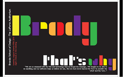
I knew from the start that I wanted to make really thick, minimalistic letters that showed off the recognizable style of Brody.
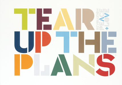
Most of my inspiration came from the image to your right. Despite the fact that Brody often involved complex backrground to stand in contrast with his simple letters, I was drawn to this simple design as well.
- Initially, the stacked style of the Freedom poster was what I was going for, but with my letterforms, "Neville" would become "New lle" or "Nev hle" It just didn't look right. It was a rough issue with my letters that had no solution.
- Also take note that BOTH posters involved vertical type which I brought into my poster design as well.
- Lastly, I want to add that my secondary typeface was Petita Bold - happily suggested by my Prof. It works well to mirror the distinct forms of my characters and the x-height ratio and what not.

I chose the colors I did beacuse Brody liked bold colors and I felt like it really stood out. My overall idea for the poster is that Brody did things differently and he did them in a way that you could not ignore. So, why Brody? ... because he's Brody. That's why.
After critique, however, I came away quite defeated. My grid is apparently weak, and I have "dead ends" in my composition. My colors don't work and the only good thing about it is my letter forms. I was really proud of the work I did and excited about the conscious choices that I made. But after hearing the criticism, which was not entirely off-base (so don't think I'm saying they were wrong), I began to see the flaws... I recognize the fact that my piece was not flawless, or even close to being awesome, but I felt as though I accomplished nothing.
Here it is: (just ignore the crop marks on the side... I had to take a screen shot on my PC because I didn't save this as a JPG...ha)

Subscribe to:
Posts (Atom)