Jun 10, 2010
May 30, 2010
Summer Project
so, in light of some things that have happened, I accidentally started a painting... when I was in a need to do some therapeutic activities... sooo it turned into something pretty cool (still a work in progress), and I decided to make a series out of it, maybe. Ya know, the process and changes in emotion as time goes on... So, my oh so large audience, keep a look out for upcoming photos and details about my summer project.
May 29, 2010
finally my final painting
Well, back in April I explained that I was working on an homage to the infamous Pablo Picasso for my final project in painting... so I finally got around to taking a picture of it for you, my viewers (whom I can probably count on one hand... but no matter!)
Unfortunately the picture really distorted the color despite my efforts to correct it... although there are a lot of cooler hues involved, the over all color of the piece is a very red-violet and a lot of oranges.
Basically this piece only have two elements to it: color and texture.
The colors I used were all very bold, oranges, violets, reds, and blues... but all the colors were acrylic washes - applied through various stages of the process (some wet-on-wet, other wet-on-dry). The gesso itself actually has sand rubbed into it to add to the over all texture of the piece. The words and figure were drawn on using acrylic paint put into a ziploc bag almost like a cake-decorating bag. It was rather fun to use an unexpected technique and my professor thought it quite clever. After the words and figure dried I did countless washes over them, creating this really interesting effect that left parts of the piece untouched - which I really really liked.
The figure is actually a blind contour, something I thought would mirror, but not replicate, the drawing style of Picasso. The quote says 'I am always doing that which I can not do in order that I may learn to do it'... this is something that I struggled with personally in the past (giving up on a new technique or lesson if it didn't immediately prove fruitful), and I felt like Picasso easily embodied a lot of the qualities that I lack, so it felt appropriate to use this quote for my piece. Furthermore, I copied the quote twice because it almost felt like a mantra, something that bears to be repeated to yourself as you try to learn its meaning...

Overall, I wanted this piece to be something that was difficult for me - and let me tell you it was. Its lack of content was what bothered me the most, and the fact that it only took me about 3 of the 5 weeks we had to work on it was the WORST part because I continually wanted to add to it - which is another weakness of mine. Picasso never worried about what others would think of his work, he would have an idea and the go for it, something that managed to occur with this painting. I tried not to over-do it, or try to hard, and I actually really liked the way it came out. I'm proud of it, to say the least, but I realize it's not a masterpiece.
May 25, 2010
song of the day
I catalog these steps now
Decisive and intentioned
precise and patterned specifically to yours.
I'm talented at breathing
Especially exhaling
So that my chest will rise and fall with yours
I'm careful not to wake you
Fearing conversation
It's better just to hold you
And keep you pacified
I'm talented with reason
I cover all the angles
I can fail before I ever try
Try to understand there's an old mistake that fools will make
And I'm the king of them, pushing everything that's good away
Wont you hold me now (I will not bend I will not break)
Wont you hold me now (I will not bend I will not break)
I am fairly agile
I can bend and not break
Or I can break and take it with a smile
And I am so resilient
I recover quickly
I'll convince you soon that I am fine
Try to understand there's and old mistake that fools will make
And I'm the king of them, pushing everything that's good away
Wont you hold me now (I will not bend I will not break)
Wont you hold me now (For you I rise, for you I fall)
Just hold me close to you, just hold me close to you
Just hold me close to you, just hold me close to you, to you
And try to understand there's and old mistake that fools will make
And I'm the king of them, pushing everything that's good away
So wont you hold me now?
Wont you hold me now?
Now, now, now, now, now
May 17, 2010

May 15, 2010
May 14, 2010
Laz Marquez?
Here is just something I stumbled upon... pretty snazzy bookcovers, or movie posters... idk. I can't read french.
for more, go to the original site: http://www.fubiz.net/2010/04/07/laz-marquez/
for more, go to the original site: http://www.fubiz.net/2010/04/07/laz-marquez/
May 11, 2010
summer begins
well... here I am trying to feel like i'm all grown up. Sitting in my new Stringer common room, I can't help but kinda wish I was home with my family running around or watching tv; instead i'm just sitting here basically alone. It's not a bad alone, I feel fine, but it's just different... this doesn't feel like a dorm because everyone is gone to work or at classes all day... so I mean, I guess this is real life.
If you don't already know, I made the difficult decision to stay in Anderson this summer as a summer RA for little to no pay. I haven't gotten another job yet, but I'm trusting that God will provide for me how He sees fit and that things will be fine so long as I pursue Him in my plans and trust Him... that's kinda hard to say.
next summer i'll be interning and working my butt off to make ends meet and pay rent in the crappy apartment I'll most likely get. so I see this summer as good practice I reckon, and quite frankly, it's going to be good overall to learn to take care of some responsibilities on my own. idk, it's a growing experience for sure - just rough right now. anyways, i'm excited about this for real, and I'm going to stop complaining now. :)
May 5, 2010
May 4, 2010
Meet Chloe

This is the typeface I developed for my final. I wanted to achieve a certain level of youthfulness and class while still maintaining legibility. It became a lot easier to create cohesive character traits once I, in face, created a real character - which is the lovely lady you see above, Chloe. I dove into her character until I knew what kind of shoes she would wear... The dynamic stroke weights mirror her dynamic personality and the classic look this creates reflects her classy style and beautifully simplistic attitude.
I neglected to mention my color scheme during my presentation, but I used these colors because they are simple, feminine and calm. The colors are repeated throughout both the illustrations and the process book. The feminine touch was really a big bonus that I achieved with my serifs because I intended for Chloe to be used in print to replace the typical typefaces in magazines.
May 3, 2010
41 fun alphabets
Amazing. 41 crazy cool alphabets... what a great thing to find on the last day of typography
check it
check it
Apr 24, 2010


Apr 23, 2010
Modern Dog Poster Designs


..so I was browsing and I came across this design company that now possesses my heart (kiiiinda like the Death Cab song).
They have about a bagillion other posters if you want to check them out. I really love the hand-made feel that most of them have and how they typically use custom type, so I'm a fan, definitely.
They have about a bagillion other posters if you want to check them out. I really love the hand-made feel that most of them have and how they typically use custom type, so I'm a fan, definitely.
Apr 20, 2010

Apr 18, 2010
final painting
so for my final painting in Painting II I'm working on an homage to Pablo Picasso... daunting I know. ha.
Basically my idea stems from two quotes of his that really hit home with me after sophomore reviews came back:
"I do that which I can not do in order that I may learn to do it"
"Action is the fundamental key to success"
These quotes basically summarize the things I need to work on not only in my art, but in life in general... so, my painting will highlight these two things in my own style. I'm excited.
Apr 14, 2010
Anyone up for some STDs?

In light of the current predicament on my campus... I thought this ad campaign would be appropriate to share.... but I'm not gossiping.
In light of the stupendous campaign posters I've found and the need for awareness, I thought I would also share the following:


Gross, I know... but dude, talk about attention getting.

aaand, I am not a fan of this poster, per say, BUT I can't help but post an add with Hitler... that's crazy. sorry about the exposure if it bothers you

So yeah... I'm really not obsessed with obscene posters, but these were strong. and I was on the subject, so I went with it.... anyways.
Apr 3, 2010
Simplicity is Beautiful
as you may or may not know, I really tend to overcomplicate things whether in the classroom, in my head, on paper, or in my art. I struggle to leave it alone, to let it be, or to admit that I can do no more... SO. I decided to look for some instances of design in which LESS works better than more...

Champion Papers

Studio on Fire
 Studio on Fire
.. .yeah just a few examples of things I wouldn't have thought of.
Champion Papers
Studio on Fire
Studio on Fire.. .yeah just a few examples of things I wouldn't have thought of.
Mar 31, 2010
reliance
so it's come to the time where you have to make a lot of decisions regarding your own life. How are you going to handle failure? How are you going to handle the uncertain? Are you going to develop your own way, or follow someone elses'? ... yeah. I'm there.
Mar 11, 2010
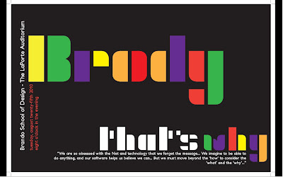
Typographically Brody
Well, Project II in Typography was to develop a typeface that mirrored the style of a designer of our choice. I chose Neville Brody. After developing your letter forms, we had to create a poster advertising said designer.
I knew from the start that I wanted to make really thick, minimalistic letters that showed off the recognizable style of Brody.
I chose the colors I did beacuse Brody liked bold colors and I felt like it really stood out. My overall idea for the poster is that Brody did things differently and he did them in a way that you could not ignore. So, why Brody? ... because he's Brody. That's why.
After critique, however, I came away quite defeated. My grid is apparently weak, and I have "dead ends" in my composition. My colors don't work and the only good thing about it is my letter forms. I was really proud of the work I did and excited about the conscious choices that I made. But after hearing the criticism, which was not entirely off-base (so don't think I'm saying they were wrong), I began to see the flaws... I recognize the fact that my piece was not flawless, or even close to being awesome, but I felt as though I accomplished nothing.
Here it is: (just ignore the crop marks on the side... I had to take a screen shot on my PC because I didn't save this as a JPG...ha)
I knew from the start that I wanted to make really thick, minimalistic letters that showed off the recognizable style of Brody.
 Most of my inspiration came from the image to your right. Despite the fact that Brody often involved complex backrground to stand in contrast with his simple letters, I was drawn to this simple design as well.
 - Initially, the stacked style of the Freedom poster was what I was going for, but with my letterforms, "Neville" would become "New lle" or "Nev hle" It just didn't look right. It was a rough issue with my letters that had no solution.
- Also take note that BOTH posters involved vertical type which I brought into my poster design as well.
- Lastly, I want to add that my secondary typeface was Petita Bold - happily suggested by my Prof. It works well to mirror the distinct forms of my characters and the x-height ratio and what not.
I chose the colors I did beacuse Brody liked bold colors and I felt like it really stood out. My overall idea for the poster is that Brody did things differently and he did them in a way that you could not ignore. So, why Brody? ... because he's Brody. That's why.
After critique, however, I came away quite defeated. My grid is apparently weak, and I have "dead ends" in my composition. My colors don't work and the only good thing about it is my letter forms. I was really proud of the work I did and excited about the conscious choices that I made. But after hearing the criticism, which was not entirely off-base (so don't think I'm saying they were wrong), I began to see the flaws... I recognize the fact that my piece was not flawless, or even close to being awesome, but I felt as though I accomplished nothing.
Here it is: (just ignore the crop marks on the side... I had to take a screen shot on my PC because I didn't save this as a JPG...ha)

One Love.
Ya know, I believe that a lot of things in this world are wrong. I believe pressing your opinions onto others is wrong. I believe that there is truth, and if people choose to look away, it is our job to show them the truth and not to condemn them for their choice. I believe that treating someone unfairly regardless of the reason is wrong - race, belief, orientation, idc.
With that in mind, get over yourself.
I read about a high school senior today named Constance McMillen today... she's a lesbian in Mississippi, and her Prom was completely canceled because she asked if she could escort her girlfriend. I mean, I'm not entirely for Gay Rights, but I am in no way against the fair treatment of human beings... It just upsets me. In one article she is quoted to have said "well, we do live in the Bible-belt..." Now, tell me... is that sending her a positive image of the Truth that we should show her? No.
I'm not getting on a podium here, but today I really saw some inequality... in how people speak, in what they say, and in how they act. It's ridiculous.
K. I'm done
Mar 5, 2010
funny the way it is
- words of Dave Matthews.
Ya know, in my last post I mentioned how I'm working to grow beyond my sudden struggles with bitterness and it's funny how God presents you moments when you really have to decide whether you're going to be bitter or whether you're going to let it go. I just, wow. unexpected, unthinkable, illogical moments that seem so insignificant, but after the initial shock you stop and think of all the terrible things that you associate with that person or place, and it hits you. "Here is my moment to really move on"... All the complaints and the hurt and the grudges just fade as you open yourself back up despite the fear nipping at your insides.
Maybe for some of you it's a family member that completely mistreated you as a kid, or an ex-boyfriend, or a rival in the workplace... who knows. But I know what gets me, and I know what I need to learn to let go of, and God is clearly working on it for me, so with His help I'm sure to overcome this.
Maybe for some of you it's a family member that completely mistreated you as a kid, or an ex-boyfriend, or a rival in the workplace... who knows. But I know what gets me, and I know what I need to learn to let go of, and God is clearly working on it for me, so with His help I'm sure to overcome this.
Feb 22, 2010
bleghhck.
frankly, I'm tired.
I'm ready for summer vacation.
I just want to sit in my hammock and read my book until Friday - no class.
That would be the life, eh? breeze coming through the open window, no worries... just the text passing before your eyes, leaving you hanging onto every word awaiting the next... Maybe eating a bon bon or two, oh wait... that's where it gets to be too much. But realistically I need to get off of my bed, get dressed, go run errands and make it to the painting lab before lunch, eat, go BACK to painting, go to my next class, leave there, find time to meet with people for my hall event, have a staff meeting, finish my #%(& drawing and typography homework and then MAYBE consider going to sleep... yeah. tired.
Now that I've complained and probably made you never want to read my blog again ("oh my god, she's so whiney"), let me clarify:
I am merely stressed, and working to overcome my bitterness, so please excuse my current foul mood.
Positivity is something I have always been great at without much effort, and I'm slowly losing sight of that, so I'm diligently working to shake whatever funk I've fallen into that has since sucked it out of me. SO, basically this post has no real meaning... just a rant and confession. thanks.
Caryn
Feb 18, 2010
The Best of Two Years Past...
As I gather up my strongest pieces from my last two years of art classes here at AU for my sophomore portfolio, I thought it would be really special to post those for you, my very valuable reader, to see. So, here is what I've been doing for the past two years in my art world:
Art 105 (Foundations) - Fall '08

Contour Project: assigned a still life to draw using contours (no shading!)


The Abstract Sculpture: This project required us to develop a sculpture from mostly foam board that would convey a social issue or issue that is relevant to many people. I chose to capture the continuing genocide in Africa due to the AIDS epidemic.
Art 106 (Foundations 2) - Spring '09

Pointillism Project: We were to create an conceptual composition using several images and render them using only dots of cyan, magenta, yellow and black. This is called "Meaning the Escape"

The Non-objective Project: For this project I chose one non-objective painting and had to interpret it and create a three dimensional sculpture to represent it. It was quite fun to do - note that this sculpture is completely free standing.
Painting I - Fall '09


Well, that's not the entire portfolio, but it's the best of it and the pieces I'm most proud of. Hope you enjoy
Caryn
Art 105 (Foundations) - Fall '08

Contour Project: assigned a still life to draw using contours (no shading!)


The Abstract Sculpture: This project required us to develop a sculpture from mostly foam board that would convey a social issue or issue that is relevant to many people. I chose to capture the continuing genocide in Africa due to the AIDS epidemic.

Pointillism Project: We were to create an conceptual composition using several images and render them using only dots of cyan, magenta, yellow and black. This is called "Meaning the Escape"

The Non-objective Project: For this project I chose one non-objective painting and had to interpret it and create a three dimensional sculpture to represent it. It was quite fun to do - note that this sculpture is completely free standing.

Photorealism Project: For this project we were to make our painting as closely identical to our chosen image as possible. I did a posterized self-portrait with a palette knife and was quite surprised how well it turned out. This is 30x36"
Graphic Design I - Fall '09
A type self portrait. This is made completely of song lyrics and is sized at about 11x17".
Well, that's not the entire portfolio, but it's the best of it and the pieces I'm most proud of. Hope you enjoy
Caryn
Feb 17, 2010
Untainted.
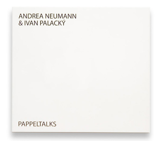
This would be the new CD you just purchased. It's a new album by Uceroz (a new music brand by Ivan Palacký), it's a musician playing an amplified knitting machine called Dopleta 160 (180). "The title “Uceroz” is an abbreviation created from two Czech words : „učesán a rozcuchán“. It consists of two editions, where „učesán“ represents a smoother kind of musical expressiveness however „rozcuchán“ tends to be more experimental."
Basically what you have here is a very new and unheard of sample of music... You reach to open the pure white package, and this is what occurs.
Now, not only is the cover "tainted" by this ink forever, but that music can never again be unheard by your ears. These designers are SO brilliant, and this is such an amazing approach to not only music, but to art and design as well. bravo.
To read more, check out: http://lovelypackage.com/pappeltalks/#more-10820
thanks.
Basically what you have here is a very new and unheard of sample of music... You reach to open the pure white package, and this is what occurs.
PAPPELTALKS from vizage on Vimeo.
Now, not only is the cover "tainted" by this ink forever, but that music can never again be unheard by your ears. These designers are SO brilliant, and this is such an amazing approach to not only music, but to art and design as well. bravo.
To read more, check out: http://lovelypackage.com/pappeltalks/#more-10820
thanks.
Feb 16, 2010
Drop: Literally Cliche

drop of a hat
drop dead
drop it like its hot
drop like flies
drop a record
drop a dime
drop a deuce
drop in a bucket
etc..
As my mind filtered through all of these, I was most attracted to 'drop like flies', 'drop in a bucket' and 'drop of a hat'
Eventually I was struggling for time and the ability to focus on one idea and one image. Most of my ideas were far too complex and I needed to settle it down. Therefore I tried to break it down to something simple that the viewer could understand that still be something that 'drop' makes me think of. Well, 'shop 'till you drop' came to mind and I went with that.
My concept summary:
The word 'drop' is associated with many cliche phrases, one of the most recognizable being "shop until you drop."
As far as my typeface choices go, I chose a serif because it mirrors the typefaces seen on a majority of the shopping bags I had to look at as well as the fact that it is highly legible and often seen in stores. Furthermore, it works well in large sizes and remains clean and legible - even when printed in all majiscules as to better suggest store signs and attention-grabbing sale signs. Even my stroke-weights are somewhat heavy, like the bags shoppers carry around.

For my finished piece, I chose to use a shot that did not use my model's face because it quickly became a focal point in most other compositions. Also, I found that the contrast between the stationary model and the movement of the actual shoppers to be very visually interesting as well as important to my concept of literally dropping. The shopping bags, while clearly not having been dropped, are lined up at the very front of the shot so that they are the obvious focal point of the image.
Overall, I am satisfied with how the shot turned out, but I realize that my concept isn't as strong as it could be. However, every interpretation I had of this word involved a cliche phrase, so I feel as though my interpretation of the word 'drop' was that its overuse leaves it only to be subject to a life of cliche existence.
Jan 26, 2010
For the love of TYPE!!
Again I find myself assigned to pick out various types of ... well, type.
SO following are ten "strong" serifs and sans serif typefaces that I have found. Enjoy.
SERIF

Gryphius, Roman (MVB): With subtle distortment, nearly chunky strokes, and a classic character style, this typeface stands out. High legibility and noticible character traits would land this guy a place on an ablum insert, movie poster, or themed billboard. I feel like the most typefaces I post on here the more wrong I get... I hope you're not looking at this thinking 'jeez this girl should give up...'

Vitesse, Bold (Hoefler & Frere-Jones): I find the round, yet square shape of the bowls in the characters really modern. It's an overall low-set typeface, making it a compact set just perfect for appealing displays. A nice magazine ad, or a tightly-designed product label.


Goudy, Oldstyle (Lanston Type Company): With the sleek, Baskerville-like style, the descender 'J', swashed 'Q', and wonderfully rounded 'O', this typeface makes for a very clean-cut, Transitional, almost calligraphic, serif. Made for clarity and elegance, this would be really well-suited for a display font, or something with frequent observation.

Diotoma, Roman (Linotype): Beautiful. It's so clean and feels really even, or uniform. It just makes me feel awesome (totally being subjective right now). I feel really strongly about the subtleties within this typeface - such as the tips of the'M' and the almost-serif on the bar of the 't'.. among others. Evident by the example of text I have here, it might be obvious that I feel as though this typeface would be great on book covers or literary publications.

Belucian, Book (Font Bureau): Sadly, I only posted one style of this typeface, but there are tons of variations that make it highly versatile and great for magazine usage (as suggested by the Bureau). With its variation in density, tracking, and style, an entire layout could be designed using this ONE typeface. cool, eh?
 Detroit Bodoni (Font Bureau): This typeface is very newspaper-headline-like... like, a kid is selling newspapers in Detroit, "Extra! Extra!... " sorry, random. Seriously, though. The characters are super stereotypical serif, roman, good level of contrast... c'mon! It's beautiful AND highly legible. Great for newspapers, books, anything that requires reading.

Koch Antiqua (Liontype): This typeface has a really calligraphic-feel to it with the diagonal counter within the 'e', the curled serif on the 'l' and the heavy stress on any curved characters. Not to mention that I'm really attracted to odd mean lines. This serif would most likely not be good to use in blocks of text, but could be manipulated to look stupendous as an identity or a one-liner title, kind of deal. (PS, Belle & Sebastian is an actual band... )

Whitney, Book (Hoefler & Frere-Jones): It's slender, tall and curvy... what else could you be looking for? ha. I feel like this typeface is very sensual (not that way, just appealing to the visual sense) because while its legibility isn't compromised, it's very smooth-feeling and would fit well on a packaging design - like shampoo, or something not too flashy.
 Whitney, Light (They are both so beautiful I had to post them both... but there are 23851365 varieties of this typeface. SO you should look at them all...these two count as one I think) ... but notice that this Light version has the double-story 'g', while the Book version does not... a foxy, two-timing typeface is what we have on our hands with this 'Whitney' character...

Bumper (Myfonts - from Bitstream): A slab sans serif (I don't think that's an actual term) that is quite cartoony in its appearance and very block-like in its form. It's bold and eye-catching - great for TV show titles, catchy commercials or billboards.

Banjoman, Text Light (Linotype): Thinly cut with very rounded form, this feels quite trendy... almost like it would be on an old diner sign that EVERYONE knows about. It's a recognizable typeface that, I feel, would be appropriate for an identity of somekind...

Neutralizer, Caps (t26 foundry): Unfortunately, this image-size and what not SUCKS and I don't have photoshop, so I apologize... BUT this is a sans typeface that I really think would make an appearace in like, Elle or GQ or whatever those magazines are called. It's thin, modern and wide-set (almost like the women who read those magazines... but I didn't say that) and is all majiscules, which also makes is a great display font or header.

Jefferson, Gothic (Lanston Type Library): So clearly this isn't an entire typeface preview, BUT it is enough for me to say that I love this typeface. The strokes are very uniform and there is variety to many of the characters, making it more versatile than it seem upon first glance. It only has majiscules characters, but seeing as it was created with purpose, one could assume it was developed for headings, display text, or really classy-cool comicstrip advertisements.
 Mahlau OT (Font Shop): Another semi-condensed, all majiscule sans. It's very Jazz-clubby... I feel like this would be used on posters for a hip club, on a street sign for a diner, or in an advertiesment for mens' cologne. It's tight and angled and sleek (I like the word 'sleek' if you haven't noticed.

Topaz, Background (Hoefler & Frere-Jones): just a simple SLEEK sans that just covers all the bases, I think. It has a rather metered set width, and it's very clean cut which makes it an excellent choice for any occasion that calls for a quick, uppercase header.

Aerle, Thin (Linotype): Ok, this may not be one of the best choices I could have made, however, I really feel like a typeface that stands out from the norm while still respecting the legibility it needs to possess is worth a shot. It's non-uniform stroke width and unusually low mean line make it interesting and therefore command a certain level of curios attention (in my opinion, anyways)... So I think this would be useful on a poster, a magazine headline or something that perhaps doesn't need to grab your attention like display letters, but can hold your notice for a while.

Enzia, Regular (Linotype): Apparently I'm really drawn to typefaces that would be found on the sides of buildings proclaiming the location of a really awesome place to chill. The subtle, almost serif-qualities, of the 'y', 'r' and others really lead the eye along despite the clean, snazzy edges of the sans. It feels very serif-y, but it's the relaxed, cross-dressing typeface that WOULD be used if I ever opened a club or coffee house.
SERIF

Mercury, Display Small Caps (Hoefler & Frere-Jones): This feeells stable and extremely roman, leaving a very classic-esque impression. It's a very even typeface, the characters seem to have very close spacing and sizing (a uniform set-width, perhaps?)... I feel like this would be great on old book covers, possibly a country club publishing... anything that needs that extra sense of superiority for its complex. ha

PL Torino Outline (Font Shop): A fresh look to the everyday serif characters. It this typeface wasn't just outlines, it would blend in (except the impressive double story 'g' and the swoosh within in) and draw little attention.. but in a world of filled-in strokes, a typeface like this can be useful to grab the eye on a printed page.

PL Torino Outline (Font Shop): A fresh look to the everyday serif characters. It this typeface wasn't just outlines, it would blend in (except the impressive double story 'g' and the swoosh within in) and draw little attention.. but in a world of filled-in strokes, a typeface like this can be useful to grab the eye on a printed page.
Gryphius, Roman (MVB): With subtle distortment, nearly chunky strokes, and a classic character style, this typeface stands out. High legibility and noticible character traits would land this guy a place on an ablum insert, movie poster, or themed billboard. I feel like the most typefaces I post on here the more wrong I get... I hope you're not looking at this thinking 'jeez this girl should give up...'

Vitesse, Bold (Hoefler & Frere-Jones): I find the round, yet square shape of the bowls in the characters really modern. It's an overall low-set typeface, making it a compact set just perfect for appealing displays. A nice magazine ad, or a tightly-designed product label.

Zigurat, Black (Hoefler & Frere-Jones): purely a bold serif typeface. It's certainly an Egyptian typeface (which, in my opinion, almost asserts its awesomeness) and it is, as intended, attention grabbing. So, this would work well on advertisements, billboards... the things that our eyes sweep across quickly - looking for shapes, not letters - so that the message is easily absorbed.

Goudy, Oldstyle (Lanston Type Company): With the sleek, Baskerville-like style, the descender 'J', swashed 'Q', and wonderfully rounded 'O', this typeface makes for a very clean-cut, Transitional, almost calligraphic, serif. Made for clarity and elegance, this would be really well-suited for a display font, or something with frequent observation.

Diotoma, Roman (Linotype): Beautiful. It's so clean and feels really even, or uniform. It just makes me feel awesome (totally being subjective right now). I feel really strongly about the subtleties within this typeface - such as the tips of the'M' and the almost-serif on the bar of the 't'.. among others. Evident by the example of text I have here, it might be obvious that I feel as though this typeface would be great on book covers or literary publications.

Belucian, Book (Font Bureau): Sadly, I only posted one style of this typeface, but there are tons of variations that make it highly versatile and great for magazine usage (as suggested by the Bureau). With its variation in density, tracking, and style, an entire layout could be designed using this ONE typeface. cool, eh?
 Detroit Bodoni (Font Bureau): This typeface is very newspaper-headline-like... like, a kid is selling newspapers in Detroit, "Extra! Extra!... " sorry, random. Seriously, though. The characters are super stereotypical serif, roman, good level of contrast... c'mon! It's beautiful AND highly legible. Great for newspapers, books, anything that requires reading.
Koch Antiqua (Liontype): This typeface has a really calligraphic-feel to it with the diagonal counter within the 'e', the curled serif on the 'l' and the heavy stress on any curved characters. Not to mention that I'm really attracted to odd mean lines. This serif would most likely not be good to use in blocks of text, but could be manipulated to look stupendous as an identity or a one-liner title, kind of deal. (PS, Belle & Sebastian is an actual band... )
SANS SERIF

Whitney, Book (Hoefler & Frere-Jones): It's slender, tall and curvy... what else could you be looking for? ha. I feel like this typeface is very sensual (not that way, just appealing to the visual sense) because while its legibility isn't compromised, it's very smooth-feeling and would fit well on a packaging design - like shampoo, or something not too flashy.
 Whitney, Light (They are both so beautiful I had to post them both... but there are 23851365 varieties of this typeface. SO you should look at them all...these two count as one I think) ... but notice that this Light version has the double-story 'g', while the Book version does not... a foxy, two-timing typeface is what we have on our hands with this 'Whitney' character...
Bumper (Myfonts - from Bitstream): A slab sans serif (I don't think that's an actual term) that is quite cartoony in its appearance and very block-like in its form. It's bold and eye-catching - great for TV show titles, catchy commercials or billboards.

Banjoman, Text Light (Linotype): Thinly cut with very rounded form, this feels quite trendy... almost like it would be on an old diner sign that EVERYONE knows about. It's a recognizable typeface that, I feel, would be appropriate for an identity of somekind...
Neutralizer, Caps (t26 foundry): Unfortunately, this image-size and what not SUCKS and I don't have photoshop, so I apologize... BUT this is a sans typeface that I really think would make an appearace in like, Elle or GQ or whatever those magazines are called. It's thin, modern and wide-set (almost like the women who read those magazines... but I didn't say that) and is all majiscules, which also makes is a great display font or header.

Verlag, Condensed Book (Hoefler & Frere-Jones): While I find this a little similar (generally speaking from an amateur) to the Whitney typeface from before, the characters have thicker strokes and aren't host to the same sensual features... making this typeface much more stable, but with the same legibility and ease on the eye. Again, packaging - or magazine layouts - would suite this guy pretty well.


Jefferson, Gothic (Lanston Type Library): So clearly this isn't an entire typeface preview, BUT it is enough for me to say that I love this typeface. The strokes are very uniform and there is variety to many of the characters, making it more versatile than it seem upon first glance. It only has majiscules characters, but seeing as it was created with purpose, one could assume it was developed for headings, display text, or really classy-cool comicstrip advertisements.

Topaz, Background (Hoefler & Frere-Jones): just a simple SLEEK sans that just covers all the bases, I think. It has a rather metered set width, and it's very clean cut which makes it an excellent choice for any occasion that calls for a quick, uppercase header.

Aerle, Thin (Linotype): Ok, this may not be one of the best choices I could have made, however, I really feel like a typeface that stands out from the norm while still respecting the legibility it needs to possess is worth a shot. It's non-uniform stroke width and unusually low mean line make it interesting and therefore command a certain level of curios attention (in my opinion, anyways)... So I think this would be useful on a poster, a magazine headline or something that perhaps doesn't need to grab your attention like display letters, but can hold your notice for a while.

Enzia, Regular (Linotype): Apparently I'm really drawn to typefaces that would be found on the sides of buildings proclaiming the location of a really awesome place to chill. The subtle, almost serif-qualities, of the 'y', 'r' and others really lead the eye along despite the clean, snazzy edges of the sans. It feels very serif-y, but it's the relaxed, cross-dressing typeface that WOULD be used if I ever opened a club or coffee house.
Subscribe to:
Posts (Atom)