frankly, I'm tired.
I'm ready for summer vacation.
I just want to sit in my hammock and read my book until Friday - no class.
That would be the life, eh? breeze coming through the open window, no worries... just the text passing before your eyes, leaving you hanging onto every word awaiting the next... Maybe eating a bon bon or two, oh wait... that's where it gets to be too much. But realistically I need to get off of my bed, get dressed, go run errands and make it to the painting lab before lunch, eat, go BACK to painting, go to my next class, leave there, find time to meet with people for my hall event, have a staff meeting, finish my #%(& drawing and typography homework and then MAYBE consider going to sleep... yeah. tired.
Now that I've complained and probably made you never want to read my blog again ("oh my god, she's so whiney"), let me clarify:
I am merely stressed, and working to overcome my bitterness, so please excuse my current foul mood.
Positivity is something I have always been great at without much effort, and I'm slowly losing sight of that, so I'm diligently working to shake whatever funk I've fallen into that has since sucked it out of me. SO, basically this post has no real meaning... just a rant and confession. thanks.
Caryn
Feb 22, 2010
Feb 18, 2010
The Best of Two Years Past...
As I gather up my strongest pieces from my last two years of art classes here at AU for my sophomore portfolio, I thought it would be really special to post those for you, my very valuable reader, to see. So, here is what I've been doing for the past two years in my art world:
Art 105 (Foundations) - Fall '08

Contour Project: assigned a still life to draw using contours (no shading!)


The Abstract Sculpture: This project required us to develop a sculpture from mostly foam board that would convey a social issue or issue that is relevant to many people. I chose to capture the continuing genocide in Africa due to the AIDS epidemic.
Art 106 (Foundations 2) - Spring '09

Pointillism Project: We were to create an conceptual composition using several images and render them using only dots of cyan, magenta, yellow and black. This is called "Meaning the Escape"

The Non-objective Project: For this project I chose one non-objective painting and had to interpret it and create a three dimensional sculpture to represent it. It was quite fun to do - note that this sculpture is completely free standing.
Painting I - Fall '09


Well, that's not the entire portfolio, but it's the best of it and the pieces I'm most proud of. Hope you enjoy
Caryn
Art 105 (Foundations) - Fall '08

Contour Project: assigned a still life to draw using contours (no shading!)


The Abstract Sculpture: This project required us to develop a sculpture from mostly foam board that would convey a social issue or issue that is relevant to many people. I chose to capture the continuing genocide in Africa due to the AIDS epidemic.

Pointillism Project: We were to create an conceptual composition using several images and render them using only dots of cyan, magenta, yellow and black. This is called "Meaning the Escape"

The Non-objective Project: For this project I chose one non-objective painting and had to interpret it and create a three dimensional sculpture to represent it. It was quite fun to do - note that this sculpture is completely free standing.

Photorealism Project: For this project we were to make our painting as closely identical to our chosen image as possible. I did a posterized self-portrait with a palette knife and was quite surprised how well it turned out. This is 30x36"
Graphic Design I - Fall '09
A type self portrait. This is made completely of song lyrics and is sized at about 11x17".
Well, that's not the entire portfolio, but it's the best of it and the pieces I'm most proud of. Hope you enjoy
Caryn
Feb 17, 2010
Untainted.
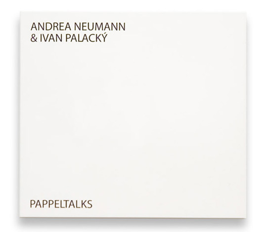
This would be the new CD you just purchased. It's a new album by Uceroz (a new music brand by Ivan Palacký), it's a musician playing an amplified knitting machine called Dopleta 160 (180). "The title “Uceroz” is an abbreviation created from two Czech words : „učesán a rozcuchán“. It consists of two editions, where „učesán“ represents a smoother kind of musical expressiveness however „rozcuchán“ tends to be more experimental."
Basically what you have here is a very new and unheard of sample of music... You reach to open the pure white package, and this is what occurs.
Now, not only is the cover "tainted" by this ink forever, but that music can never again be unheard by your ears. These designers are SO brilliant, and this is such an amazing approach to not only music, but to art and design as well. bravo.
To read more, check out: http://lovelypackage.com/pappeltalks/#more-10820
thanks.
Basically what you have here is a very new and unheard of sample of music... You reach to open the pure white package, and this is what occurs.
PAPPELTALKS from vizage on Vimeo.
Now, not only is the cover "tainted" by this ink forever, but that music can never again be unheard by your ears. These designers are SO brilliant, and this is such an amazing approach to not only music, but to art and design as well. bravo.
To read more, check out: http://lovelypackage.com/pappeltalks/#more-10820
thanks.
Feb 16, 2010
Drop: Literally Cliche

drop of a hat
drop dead
drop it like its hot
drop like flies
drop a record
drop a dime
drop a deuce
drop in a bucket
etc..
As my mind filtered through all of these, I was most attracted to 'drop like flies', 'drop in a bucket' and 'drop of a hat'
Eventually I was struggling for time and the ability to focus on one idea and one image. Most of my ideas were far too complex and I needed to settle it down. Therefore I tried to break it down to something simple that the viewer could understand that still be something that 'drop' makes me think of. Well, 'shop 'till you drop' came to mind and I went with that.
My concept summary:
The word 'drop' is associated with many cliche phrases, one of the most recognizable being "shop until you drop."
As far as my typeface choices go, I chose a serif because it mirrors the typefaces seen on a majority of the shopping bags I had to look at as well as the fact that it is highly legible and often seen in stores. Furthermore, it works well in large sizes and remains clean and legible - even when printed in all majiscules as to better suggest store signs and attention-grabbing sale signs. Even my stroke-weights are somewhat heavy, like the bags shoppers carry around.

For my finished piece, I chose to use a shot that did not use my model's face because it quickly became a focal point in most other compositions. Also, I found that the contrast between the stationary model and the movement of the actual shoppers to be very visually interesting as well as important to my concept of literally dropping. The shopping bags, while clearly not having been dropped, are lined up at the very front of the shot so that they are the obvious focal point of the image.
Overall, I am satisfied with how the shot turned out, but I realize that my concept isn't as strong as it could be. However, every interpretation I had of this word involved a cliche phrase, so I feel as though my interpretation of the word 'drop' was that its overuse leaves it only to be subject to a life of cliche existence.
Jan 26, 2010
For the love of TYPE!!
Again I find myself assigned to pick out various types of ... well, type.
SO following are ten "strong" serifs and sans serif typefaces that I have found. Enjoy.
SERIF

Gryphius, Roman (MVB): With subtle distortment, nearly chunky strokes, and a classic character style, this typeface stands out. High legibility and noticible character traits would land this guy a place on an ablum insert, movie poster, or themed billboard. I feel like the most typefaces I post on here the more wrong I get... I hope you're not looking at this thinking 'jeez this girl should give up...'

Vitesse, Bold (Hoefler & Frere-Jones): I find the round, yet square shape of the bowls in the characters really modern. It's an overall low-set typeface, making it a compact set just perfect for appealing displays. A nice magazine ad, or a tightly-designed product label.


Goudy, Oldstyle (Lanston Type Company): With the sleek, Baskerville-like style, the descender 'J', swashed 'Q', and wonderfully rounded 'O', this typeface makes for a very clean-cut, Transitional, almost calligraphic, serif. Made for clarity and elegance, this would be really well-suited for a display font, or something with frequent observation.

Diotoma, Roman (Linotype): Beautiful. It's so clean and feels really even, or uniform. It just makes me feel awesome (totally being subjective right now). I feel really strongly about the subtleties within this typeface - such as the tips of the'M' and the almost-serif on the bar of the 't'.. among others. Evident by the example of text I have here, it might be obvious that I feel as though this typeface would be great on book covers or literary publications.

Belucian, Book (Font Bureau): Sadly, I only posted one style of this typeface, but there are tons of variations that make it highly versatile and great for magazine usage (as suggested by the Bureau). With its variation in density, tracking, and style, an entire layout could be designed using this ONE typeface. cool, eh?
 Detroit Bodoni (Font Bureau): This typeface is very newspaper-headline-like... like, a kid is selling newspapers in Detroit, "Extra! Extra!... " sorry, random. Seriously, though. The characters are super stereotypical serif, roman, good level of contrast... c'mon! It's beautiful AND highly legible. Great for newspapers, books, anything that requires reading.

Koch Antiqua (Liontype): This typeface has a really calligraphic-feel to it with the diagonal counter within the 'e', the curled serif on the 'l' and the heavy stress on any curved characters. Not to mention that I'm really attracted to odd mean lines. This serif would most likely not be good to use in blocks of text, but could be manipulated to look stupendous as an identity or a one-liner title, kind of deal. (PS, Belle & Sebastian is an actual band... )

Whitney, Book (Hoefler & Frere-Jones): It's slender, tall and curvy... what else could you be looking for? ha. I feel like this typeface is very sensual (not that way, just appealing to the visual sense) because while its legibility isn't compromised, it's very smooth-feeling and would fit well on a packaging design - like shampoo, or something not too flashy.
 Whitney, Light (They are both so beautiful I had to post them both... but there are 23851365 varieties of this typeface. SO you should look at them all...these two count as one I think) ... but notice that this Light version has the double-story 'g', while the Book version does not... a foxy, two-timing typeface is what we have on our hands with this 'Whitney' character...

Bumper (Myfonts - from Bitstream): A slab sans serif (I don't think that's an actual term) that is quite cartoony in its appearance and very block-like in its form. It's bold and eye-catching - great for TV show titles, catchy commercials or billboards.

Banjoman, Text Light (Linotype): Thinly cut with very rounded form, this feels quite trendy... almost like it would be on an old diner sign that EVERYONE knows about. It's a recognizable typeface that, I feel, would be appropriate for an identity of somekind...

Neutralizer, Caps (t26 foundry): Unfortunately, this image-size and what not SUCKS and I don't have photoshop, so I apologize... BUT this is a sans typeface that I really think would make an appearace in like, Elle or GQ or whatever those magazines are called. It's thin, modern and wide-set (almost like the women who read those magazines... but I didn't say that) and is all majiscules, which also makes is a great display font or header.

Jefferson, Gothic (Lanston Type Library): So clearly this isn't an entire typeface preview, BUT it is enough for me to say that I love this typeface. The strokes are very uniform and there is variety to many of the characters, making it more versatile than it seem upon first glance. It only has majiscules characters, but seeing as it was created with purpose, one could assume it was developed for headings, display text, or really classy-cool comicstrip advertisements.
 Mahlau OT (Font Shop): Another semi-condensed, all majiscule sans. It's very Jazz-clubby... I feel like this would be used on posters for a hip club, on a street sign for a diner, or in an advertiesment for mens' cologne. It's tight and angled and sleek (I like the word 'sleek' if you haven't noticed.

Topaz, Background (Hoefler & Frere-Jones): just a simple SLEEK sans that just covers all the bases, I think. It has a rather metered set width, and it's very clean cut which makes it an excellent choice for any occasion that calls for a quick, uppercase header.

Aerle, Thin (Linotype): Ok, this may not be one of the best choices I could have made, however, I really feel like a typeface that stands out from the norm while still respecting the legibility it needs to possess is worth a shot. It's non-uniform stroke width and unusually low mean line make it interesting and therefore command a certain level of curios attention (in my opinion, anyways)... So I think this would be useful on a poster, a magazine headline or something that perhaps doesn't need to grab your attention like display letters, but can hold your notice for a while.

Enzia, Regular (Linotype): Apparently I'm really drawn to typefaces that would be found on the sides of buildings proclaiming the location of a really awesome place to chill. The subtle, almost serif-qualities, of the 'y', 'r' and others really lead the eye along despite the clean, snazzy edges of the sans. It feels very serif-y, but it's the relaxed, cross-dressing typeface that WOULD be used if I ever opened a club or coffee house.
SERIF

Mercury, Display Small Caps (Hoefler & Frere-Jones): This feeells stable and extremely roman, leaving a very classic-esque impression. It's a very even typeface, the characters seem to have very close spacing and sizing (a uniform set-width, perhaps?)... I feel like this would be great on old book covers, possibly a country club publishing... anything that needs that extra sense of superiority for its complex. ha

PL Torino Outline (Font Shop): A fresh look to the everyday serif characters. It this typeface wasn't just outlines, it would blend in (except the impressive double story 'g' and the swoosh within in) and draw little attention.. but in a world of filled-in strokes, a typeface like this can be useful to grab the eye on a printed page.

PL Torino Outline (Font Shop): A fresh look to the everyday serif characters. It this typeface wasn't just outlines, it would blend in (except the impressive double story 'g' and the swoosh within in) and draw little attention.. but in a world of filled-in strokes, a typeface like this can be useful to grab the eye on a printed page.

Gryphius, Roman (MVB): With subtle distortment, nearly chunky strokes, and a classic character style, this typeface stands out. High legibility and noticible character traits would land this guy a place on an ablum insert, movie poster, or themed billboard. I feel like the most typefaces I post on here the more wrong I get... I hope you're not looking at this thinking 'jeez this girl should give up...'

Vitesse, Bold (Hoefler & Frere-Jones): I find the round, yet square shape of the bowls in the characters really modern. It's an overall low-set typeface, making it a compact set just perfect for appealing displays. A nice magazine ad, or a tightly-designed product label.

Zigurat, Black (Hoefler & Frere-Jones): purely a bold serif typeface. It's certainly an Egyptian typeface (which, in my opinion, almost asserts its awesomeness) and it is, as intended, attention grabbing. So, this would work well on advertisements, billboards... the things that our eyes sweep across quickly - looking for shapes, not letters - so that the message is easily absorbed.

Goudy, Oldstyle (Lanston Type Company): With the sleek, Baskerville-like style, the descender 'J', swashed 'Q', and wonderfully rounded 'O', this typeface makes for a very clean-cut, Transitional, almost calligraphic, serif. Made for clarity and elegance, this would be really well-suited for a display font, or something with frequent observation.

Diotoma, Roman (Linotype): Beautiful. It's so clean and feels really even, or uniform. It just makes me feel awesome (totally being subjective right now). I feel really strongly about the subtleties within this typeface - such as the tips of the'M' and the almost-serif on the bar of the 't'.. among others. Evident by the example of text I have here, it might be obvious that I feel as though this typeface would be great on book covers or literary publications.

Belucian, Book (Font Bureau): Sadly, I only posted one style of this typeface, but there are tons of variations that make it highly versatile and great for magazine usage (as suggested by the Bureau). With its variation in density, tracking, and style, an entire layout could be designed using this ONE typeface. cool, eh?
 Detroit Bodoni (Font Bureau): This typeface is very newspaper-headline-like... like, a kid is selling newspapers in Detroit, "Extra! Extra!... " sorry, random. Seriously, though. The characters are super stereotypical serif, roman, good level of contrast... c'mon! It's beautiful AND highly legible. Great for newspapers, books, anything that requires reading.
Koch Antiqua (Liontype): This typeface has a really calligraphic-feel to it with the diagonal counter within the 'e', the curled serif on the 'l' and the heavy stress on any curved characters. Not to mention that I'm really attracted to odd mean lines. This serif would most likely not be good to use in blocks of text, but could be manipulated to look stupendous as an identity or a one-liner title, kind of deal. (PS, Belle & Sebastian is an actual band... )
SANS SERIF

Whitney, Book (Hoefler & Frere-Jones): It's slender, tall and curvy... what else could you be looking for? ha. I feel like this typeface is very sensual (not that way, just appealing to the visual sense) because while its legibility isn't compromised, it's very smooth-feeling and would fit well on a packaging design - like shampoo, or something not too flashy.
 Whitney, Light (They are both so beautiful I had to post them both... but there are 23851365 varieties of this typeface. SO you should look at them all...these two count as one I think) ... but notice that this Light version has the double-story 'g', while the Book version does not... a foxy, two-timing typeface is what we have on our hands with this 'Whitney' character...
Bumper (Myfonts - from Bitstream): A slab sans serif (I don't think that's an actual term) that is quite cartoony in its appearance and very block-like in its form. It's bold and eye-catching - great for TV show titles, catchy commercials or billboards.

Banjoman, Text Light (Linotype): Thinly cut with very rounded form, this feels quite trendy... almost like it would be on an old diner sign that EVERYONE knows about. It's a recognizable typeface that, I feel, would be appropriate for an identity of somekind...

Neutralizer, Caps (t26 foundry): Unfortunately, this image-size and what not SUCKS and I don't have photoshop, so I apologize... BUT this is a sans typeface that I really think would make an appearace in like, Elle or GQ or whatever those magazines are called. It's thin, modern and wide-set (almost like the women who read those magazines... but I didn't say that) and is all majiscules, which also makes is a great display font or header.

Verlag, Condensed Book (Hoefler & Frere-Jones): While I find this a little similar (generally speaking from an amateur) to the Whitney typeface from before, the characters have thicker strokes and aren't host to the same sensual features... making this typeface much more stable, but with the same legibility and ease on the eye. Again, packaging - or magazine layouts - would suite this guy pretty well.


Jefferson, Gothic (Lanston Type Library): So clearly this isn't an entire typeface preview, BUT it is enough for me to say that I love this typeface. The strokes are very uniform and there is variety to many of the characters, making it more versatile than it seem upon first glance. It only has majiscules characters, but seeing as it was created with purpose, one could assume it was developed for headings, display text, or really classy-cool comicstrip advertisements.
Mahlau OT (Font Shop): Another semi-condensed, all majiscule sans. It's very Jazz-clubby... I feel like this would be used on posters for a hip club, on a street sign for a diner, or in an advertiesment for mens' cologne. It's tight and angled and sleek (I like the word 'sleek' if you haven't noticed.
Topaz, Background (Hoefler & Frere-Jones): just a simple SLEEK sans that just covers all the bases, I think. It has a rather metered set width, and it's very clean cut which makes it an excellent choice for any occasion that calls for a quick, uppercase header.

Aerle, Thin (Linotype): Ok, this may not be one of the best choices I could have made, however, I really feel like a typeface that stands out from the norm while still respecting the legibility it needs to possess is worth a shot. It's non-uniform stroke width and unusually low mean line make it interesting and therefore command a certain level of curios attention (in my opinion, anyways)... So I think this would be useful on a poster, a magazine headline or something that perhaps doesn't need to grab your attention like display letters, but can hold your notice for a while.

Enzia, Regular (Linotype): Apparently I'm really drawn to typefaces that would be found on the sides of buildings proclaiming the location of a really awesome place to chill. The subtle, almost serif-qualities, of the 'y', 'r' and others really lead the eye along despite the clean, snazzy edges of the sans. It feels very serif-y, but it's the relaxed, cross-dressing typeface that WOULD be used if I ever opened a club or coffee house.
Jan 23, 2010
Hanger Tea
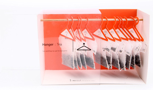
So I was looking around, and I came across this new tea packaging design. 
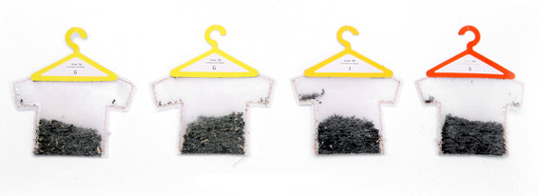
It's made to be able to fit into its package like this:
 AAAND this design is not only appealing visually, but it's functional. The hook at the top allows the tea bag to hang quite nicely off the side of your mug. So clever. See more about it here
 AAAND this design is not only appealing visually, but it's functional. The hook at the top allows the tea bag to hang quite nicely off the side of your mug. So clever. See more about it here
Jan 12, 2010
Fonts of Taste
Ok, so I'm in a Typography class and I'm basically stoked about it entirely. Our first assignment was to post four fonts that we like, and one we do not. Although I had never heard of any of these fonts before, the following four fonts embody several of my favorite characteristics of fonts/types.
"Fugu" by Neil Summerour
The messy handwriting
This font is considered "rough script" by some, and I really like that type of style a lot. While this one airs on the side of Asian-esque, I still like this genre of type.
"Fugu" by Neil Summerour
The messy handwriting
This font is considered "rough script" by some, and I really like that type of style a lot. While this one airs on the side of Asian-esque, I still like this genre of type.

"FF Trixie Rough OT Light" by Erik van Blokland
The Distressed Typewriter
So it it's a bit overused sometimes, and it doesn't always have to be distressed (just a plain typewriter font will do), but I have always been really drawn to the look and feel of a typewrite typeface. It's recognizable by all age demographics and it's just plain cool.
The Distressed Typewriter
So it it's a bit overused sometimes, and it doesn't always have to be distressed (just a plain typewriter font will do), but I have always been really drawn to the look and feel of a typewrite typeface. It's recognizable by all age demographics and it's just plain cool.

"Rosedelia" by: Carlos Fabián Camargo Guerrero
Calligraphic Grunge
I really like most fonts that follow this type of genre... One of my most favorite fonts of all time is Jellyka Castle's Queen (like it or not!). I think these types are really easily abused or overused, but the look of them can really do well in certain projects and pieces.
Calligraphic Grunge
I really like most fonts that follow this type of genre... One of my most favorite fonts of all time is Jellyka Castle's Queen (like it or not!). I think these types are really easily abused or overused, but the look of them can really do well in certain projects and pieces.

"Vesper"
(see how it was created here)
Distinct Serif
I'm not only a crazy type lady, I do enjoy a simple serif every now and then, but it has to be somewhat different. This type was eye catching because there are such subtle combinations in script and serif and block lettering (in my untrained opinion) that I simply couldn't leave it behind.

"Memoriam" by:Patrick Griffin
The curly-que using ball-on-edge crap.
I do not like this type because it is difficult to follow (as is the calligraphic grunge at times), it has too many elements and I just don't enjoy little circles tagged onto the edges of letters for the most part. The drastic variation in line thickness(I'm sure there is a more accurate term for this) just distracts me soo much

Subscribe to:
Posts (Atom)